Packaging to share the joy of a one-of-a-kind ice creamery.
BRANDING
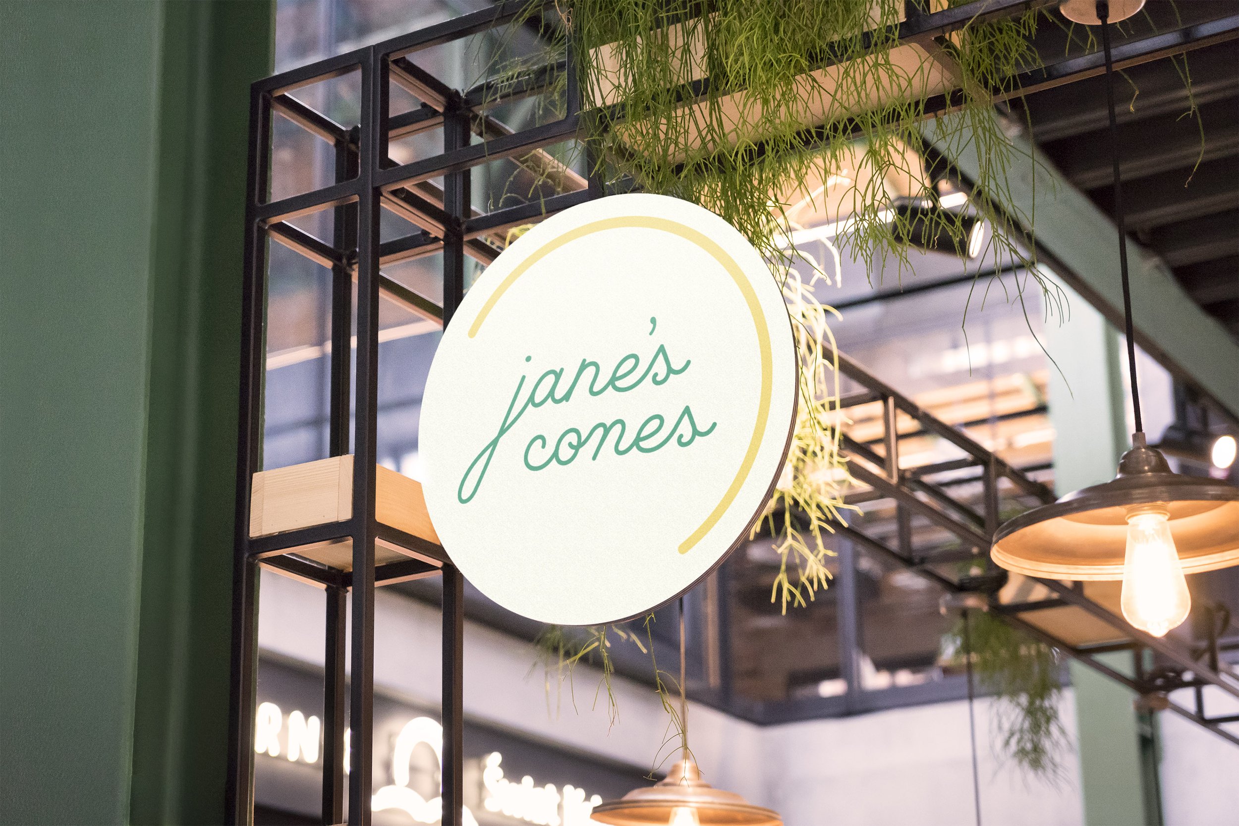
SIGNAGE
PACKAGING
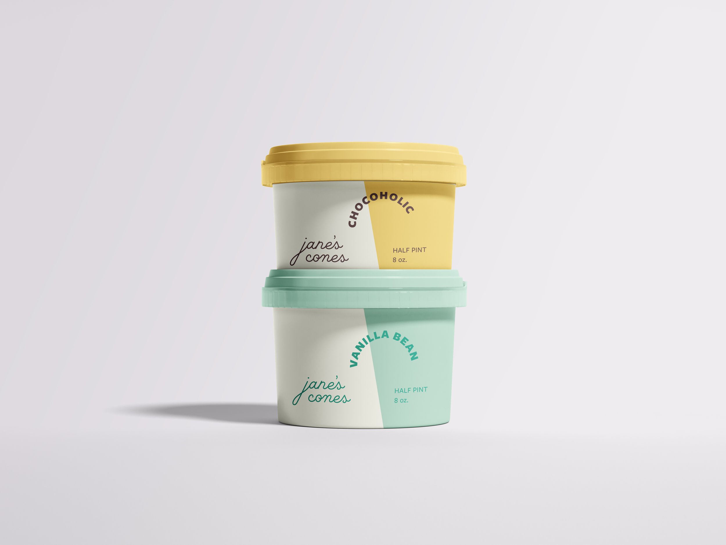
Jane’s Cones is a concept company specializing in hand-made ice cream using locally-sourced ingredients. Their business model supports their local dairy economy and in everything they do, they are true to their motto, “Happy & Good.”
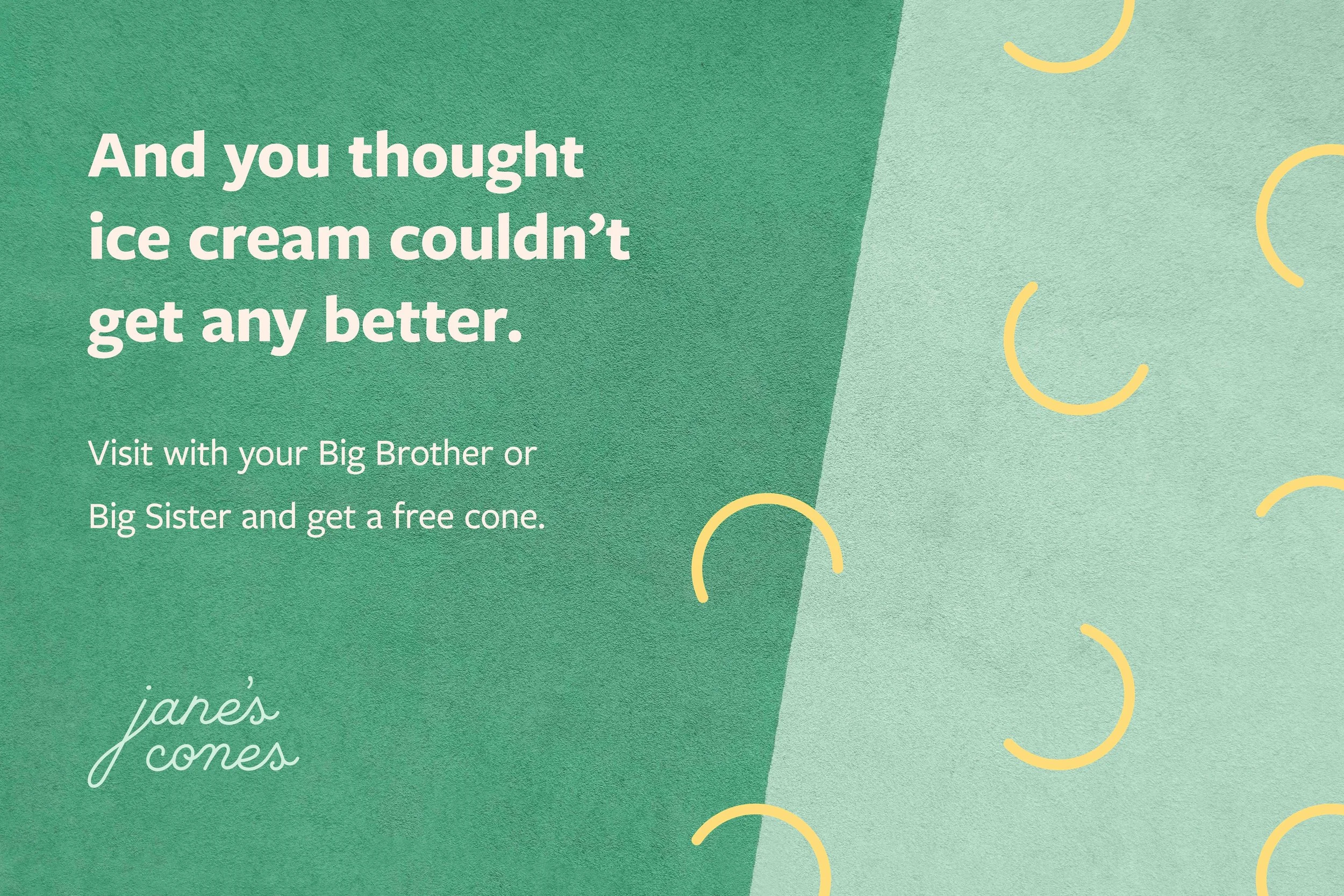
I designed a joyful brand identity, capturing the company’s upbeat personality. The creamy color scheme was inspired by Jane’s delicious flavors, with pops of vibrant hues for accents. Round accents, reminiscent of ice cream scoops, punctuate the brand with a soft and sweet positivity.